|
|
|
|
|
|
|
|
JFC
Reversal Indicator
The
JFC Reversal Indicator is the first of the group of four indicators which we
will use to define the short term trend for day trading purposes.
This
indicator is universal in nature and can be used on any bar chart, any market,
any time frame.
Inputs
There are two inputs for the JFC
Reversal Indicator, “SENS” and “PLT”.
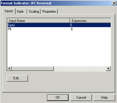
Both
of these inputs are provided to enable the user to more closely adjust the plots
of this tool to his / her individual trading style.
The
“SENS” plot allows the user to adjust the sensitivity of the indicator. The
lower the number, the more sensitive will be the plot. When you use a lower
number, the indicator will interpret impending exhaustion at an earlier stage
than if a higher number is used. Since the plots will begin sooner when you use
a lower number, it is possible to get more trading signals with a lower number
being used in this input.
Generally, you will want to
use lower numbers for longer time frames. For example, the indicator as you
received it will be defaulted to a value of 5 which is what we use for most of
our one minute charts on the Dow Futures Contract and most of the more active
stock issues.
If your trading is based on a
30-minute chart of the same issue a sensitivity of 2 would be necessary to get
any signals of exhaustion for entry.
On the other hand, if your
trading style dictates the use of an extremely short time frame such as a 5 tick
bar, settings as high as 10 may be necessary to get meaningful signals from this
indicator. You will soon discover the setting which is proper for your trading
style after working with it for a few days on your favorite market(s) and
experimenting with various values for this input.
The second input for the JFC
Reversal Indicator, “PLT”, simply sets the plotting distance between the
high or low of the bar and the small cyan or magenta squares which comprise the
plots of this indicator.
The indicator is defaulted to
.6 which will result in the plotting
sequence you will observe on the demonstration charts on your CD ROM for this
indicator as plotted on the Dow Futures and various stock issues.
When plotting this tool on a
contract that is scaled by 1/32, such as the popular 30 Year Treasury Bond
contract, a value of .01
will result in a useable chart. This input is simply a convenient way to locate
the plots of the indicator with reference to the high or the low of the bar in
order to present the user with a readable, organized chart.
This plot has absolutely nothing to do with the calculations which deal with the actual exhaustion definition and therefore has no effect on the workings of the indicator other than plot location.
Style
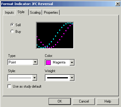
The
style inputs for the JFC Reversal Indicator should be set as above. The sell tab
color is defaulted to a dark pink, or magenta Point with moderate weighting
while the Buy tab is set to a light blue, or cyan Point with the identical
weight selections. The user should feel free to change colors if for some reason
an alternate scheme better fits your chart background, etc.
Scaling
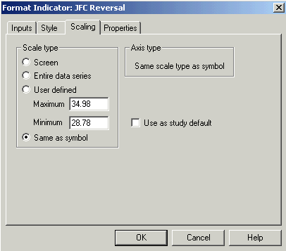
It
is important that the scaling section always be set to “Same as price data”
as shown in the illustration on the preceding page. Other settings will not
result in a useable plot.
Properties
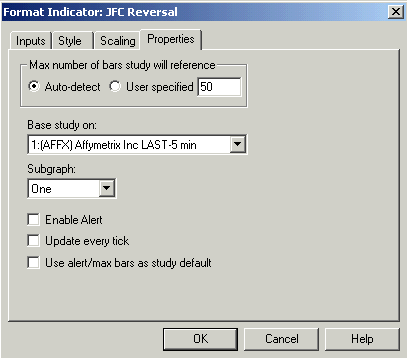
For most consistent results
the auto-detect button should be selected on this screen.
There
is an alert programmed into this indicator which will notify the user when the
indicator stops plotting, thus
signifying a high probability of the completion of an exhaustion phase. You must
enable the alert as shown above. Should you wish to disable or turn off this
alert, remove the check mark on the Enable Alert tab. After the check mark
disappears click OK. The alert will no longer function until you enable it again
with the same tab.
If
you wish to have the alert disabled each time it is plotted then check the lower
box on this page. This will reset the default on the indicator so the alert will
not function until these settings are reset.
This
indicator has its primary use in the discovery of the Minor trend of the day. It
will be used in combination with the JFC Exhaustion Indicator, the JFC Real Time
Pivot Indicator and the JFC Cluster Indicator to identify a buying or selling zone
within which we will want to take action.
There
is a unique characteristic involving this indicator which is critical to its
correct interpretation and usage.
Most, if not all, trading
indicators give their signals when they are first appear on the screen. The JFC
Reversal Indicator is actually important both when it begins to appear but also
when it stops plotting.
The
indicator, when it BEGINS to appear, is in indicative of a trend
which is beginning to exhibit signs of exhaustion.
If you will recall our
previous discussion in the section of the manual which discusses general
exhaustion, we compared a rising market to a basketball being thrown into the
air. You will recall we stated that it was easy to determine when the ball was
about to change direction but significantly more difficult to correctly identify
the same condition in a rising market. This tool was designed to specifically
solve this problem and point out current trends which are showing signs of
“running out of steam” so to speak.
When
this indicator STOPS plotting, it is telling the user that the exhaustion phase
is complete and a change in market direction is probable within this price zone.
If
the area defined by this tool is indeed a turning point in the market it will be
confirmed by JFC Real Time Pivot, JFC Exhaustion and JFC Cluster. An exact
level for entry will then be calculated by the JFC Entry Point Indicator.
It
is appropriate at this point to discuss another unique aspect of this indicator.
As we said, the indicator is important both when it begins its plotting sequence
and when the indicator stops plotting.
Thus
the first dot is significant, as is the last dot.
All
those in between, other than as a reminder that the indicator is plotting, are
of relative insignificance.
In other words, a successive
string of these plots which number 5 or 10 or more is no more significant that a
single dot.
If
only one dot appears, it is interpreted as the plot beginning and ending on the
same dot. In this case, the exhaustion phase is extremely short, as defined by
the JFC Reversal Indicator, but equally significant from a minor trend
definition point of view.
When
the JFC Reversal Indicator is plotted on a price charts you will notice a series
of small light blue, or cyan, dots below some of the price bars. You will also
notice several series of light red, or magenta, squares placed above several of
the price bars.
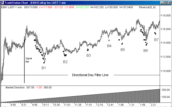
The
chart above is a black and white version of Manual Image #5. Since much of the
use of this indicator depends on the various color plots generated, you may wish
to refer to charts 22 through 24 on the menu bar which is the full color image
of this identical chart. Also, charts 22 through 24 on the CD ROM provide
additional instruction on the use of this indicator.
Unlike
the color image from the CD ROM which shows both “magenta & cyan
squares”, this black and white chart demonstrates only the “cyan squares”.
Since
we are working with an UP Trend and therefore looking for only BUY zones on this
chart, we will focus on these BUY zones as defined by the “cyan squares”
plotted by JFC Reversal. The following references made to “cyan squares”
will apply to the small black squares as they appear beneath the price bars on
this Ebay chart.
On
this one-minute chart of E Bay you will notice that we have placed both the JFC
Market Direction Indicator and the JFC Directional Day Filter Indicator, much as
you would do on your own trading charts.
Obviously,
from the perspective of both of these Major Trend Indicators, we are working
with a day exhibiting a strong uptrend, therefore, we will only
be working the buy side of the
market on this chart.
With this in mind, and
recalling that we do not asses the trend of the day using these two indicators
until the JFC Directional Day Filter’s Signal Bar is painted, we will confine our
observations to the area of the price chart which occurs after this Signal Bar
appears.
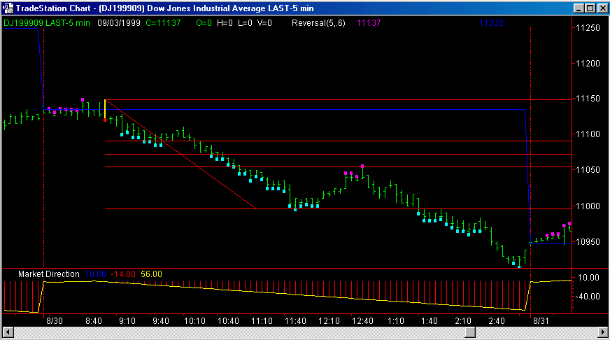
Note
the first series of cyan squares as they appear on the chart at 9:53 am.
Recall that the appearance of
cyan squares on the charts are the first indication of a downtrend which is
beginning to exhibit signs of exhaustion.
At
this point in time our indicator is only giving us a “heads up” that the
current trend may be running out of downside energy. We will do nothing at this
point except continue to monitor the chart for additional signs that we are
entering a zone on the price chart
where a buy may be taken.
The cyan squares cease to
plot at 10:18 am ( B1 on the chart ) at which time the indicator is giving
positive evidence that the current downtrend has reached exhaustion and a move
to the upside is in order. Note that this downtrend, as defined by the JFC
Reversal Indicator, was in a state of impending exhaustion for 25 minutes.
Although this is a rather long period for the indicator to plot, it is a good
trend to use to point out that the length of the series of dots plotted by the
indicator is of little significance. The significant event of this tool is when
it ceases plotting, as is evident at point B1 on the chart.
At
this point, it we were actually trading, we would be looking to the JFC Real
Time Pivot Indicator, the JFC Exhaustion Indicator and the JFC Cluster Indicator
for additional confirmation of exhaustion. Should all four of these tools
confirm our presence in a buy zone
we would then look to the JFC Entry Point Indicator to define for us an exact
point at which to enter the market.
Please
understand that even though in this example one could have bought the market at
the exact moment the indicator ceased plotting, such entries are statistically
high risk without the use of the other confirming indicators to place us
properly in the buy zone.
The
probability of a profitable trade also rises significantly when one uses the JFC
Entry Point Indicator to pick an exact entry. We will continue to emphasize
throughout this course the importance of using these tools in combination with
each other to achieve a high probability of a winning trade.
Further
on into the chart, note the buy signals given at points B2 through B7 as the day
progresses. Also note the number of cyan dots which make up each of the buy
signals.
Observe
that the buy signal at B4, where only one cyan square appears, was as
effective as many of the other signals which displayed several more
points. This graphically points out that the number of squares plotted has minor
significance concerning the accuracy of the subsequent signal.
It
is also worth while to point out, before leaving this chart, the magenta squares
which appear above the price bars on the CD ROM image. These are sell signals
issued by the same indicator. We are not acting on these signals in this example
since the day is clearly in an uptrend as indicated by the two Major Trend
Indicators on the chart, the JFC Market Direction and JFC Directional Day Filter
Indicators.
If
one carefully examines these sell signals, the advantage of knowing the major
trend of the day early in the process becomes readily evident. Although some of
these signals could have resulted in a positive trade, many others would have
resulted in a significant drawdown or outright losses. Contrast this with the
performance of the buy signals which are taken in the direction of the
predominant trend. In few instances would any of these signals resulted in
significant drawdown or losing trades.
Going
on to the next day in this series, (Chart
22 above)
we see another day defined as in an uptrend by the Major Trend Indicators.
Note
once again that we will defer analysis of this chart until the JFC Market
Direction and JFC Directional Day Filter have received sufficient data to make an accurate
determination of the trend of the day.
Note
that the JFC Reversal Indicator gives a legitimate buy zone identification
shortly after the Signal Bar placed by the JFC Directional Day Filter appears. Subsequent
buy zones are located at points B2 through B8 when the cyan squares stop
appearing.
Let’s now pay close
attention to the signal generated at point B5.
At
first glance, this would appear to be a signal which would get us into a losing
trade. However, when we later apply other indicators in combination with JFC
Reversal we will see how the multiple determinations of exhaustion will filter
out this trade. Additionally, when we use the JFC Entry Point Indicator, we will
see how this tool would also have kept us out of trouble here.
The
same situation occurs at point B8 as the use of the JFC Entry Point Indicator
would not have allowed a buy to occur here.
We will explain the JFC Entry Point indicator in detail later in the manual, however, you may refer to CD ROM Video Images 37 through 39 to get a feel for how this tool would be interpreted in this situation.
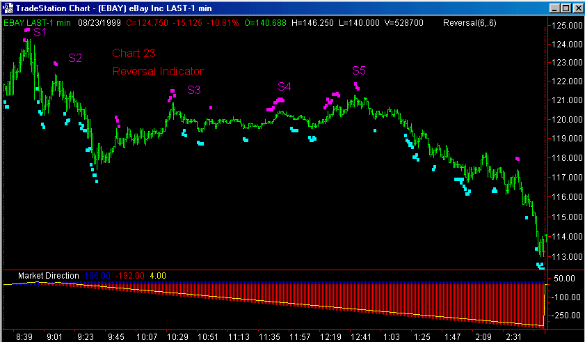
Let
us now focus our attention on Chart 23 to observe the activity of this tool on a
downward trending day.
As
always, we will first focus on the Major Trend Indicators to get the trend
direction for the day. Although the JFC Market Direction Indicator does not give
a definitive direction at the time of the JFC Directional Day Filter’s Signal
Bar, the JFC Directional Day Filter is giving clear indications that the
remainder of the day will see weak price activity.
As
the day progresses, the JFC Market Direction Indicator confirms the downtrend as
the red histogram becomes more and more prominent.
Although
we do get several indications of exhaustion at the S1 point on the chart, these
signals will not be confirmed by the other exhaustion indicators. Additionally,
the JFC Entry Point indicator will not give a selling price that would be
executed in this instance.
At
the S2 area we have an exhaustion area which will be confirmed by the other
exhaustion tools and a valid entry by the JFC Entry Point Indicator.
The same is true for selling
zones identified at S3 and S4. Although the signals generated here would not
have been significantly profitable, observe what happens when the sell signal is
issued at point S5. Combinations here would have resulted in a short entry at
approximately 120.00 which is an excellent setup for the down move which
follows. Note also that the JFC Reversal Indicator gives additional selling
points on the way down which can be used for re - entry or to add to existing
profitable short positions.
Notice
here the importance of determining the Major Trend early in the trading day.
Note,
in the severe down trend which we were able to enter using only the sell
signals, how the multiple buy signals generated as the market declined were
nearly all entry zones which would have resulted in losing trades. The
simple fact that we were only taking short trades on this down trending day was
a major factor in making this a profitable day.
It
is also important to point out on this chart that, even though the first three
trades generated would have been only modestly profitable, if not only
breakeven, the final major signal of the day would have been a huge success had
we taken all the trades for the system on this day. The obvious danger here is a
common problem when a trader becomes discouraged or bored with the so - so
results of the first 3 trades of the day and abandons the system only to see the
best trade of the day happen while he / she is on the sidelines.
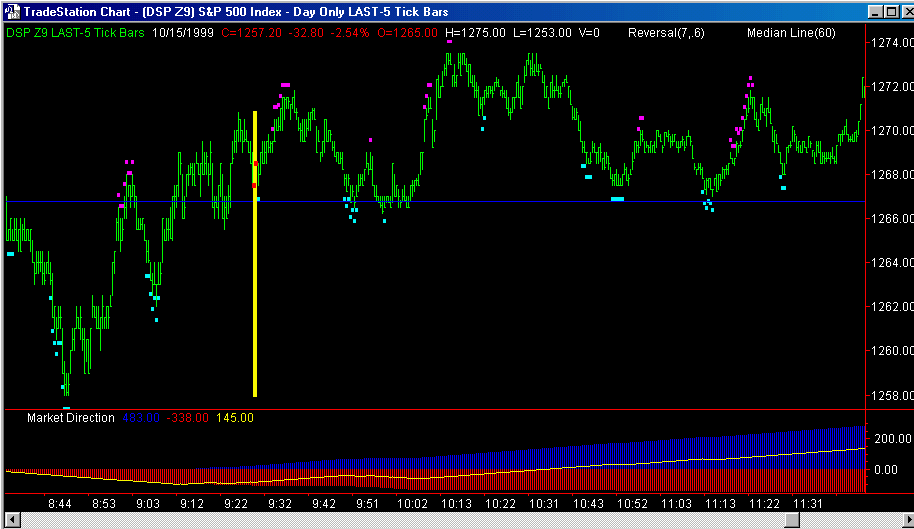
To
demonstrate the use of the JFC Reversal Indicator on an ultra - short time frame
lets take a look at the first half of one day on a 5 tick chart of the volatile
S&P 500 futures market on the chart above.
On
this type of chart a new bar is formed with the passage of only 5 price changes
- thus an entire bar on this chart will cover only few seconds in time when the
market gets busy. Many people prefer trading with this type of chart since all
time distortions are removed.
Note
that the trend for the day can best be described as having no clear direction,
(sideways day) as defined by our two Major Trend indicators. This allows us to
take trades on both sides of the market.
At
this point in our discussion you will be able to recognize the various buy and
sell zones as identified by the JFC Reversal Indicator.
Also
worth pointing out on this chart is the typical activity of the JFC Directional Day Filter
as it provides support for the market on two separate occasions during the 9:50
and 10:10 time frame.
See
the manual section on the JFC Directional Day Filter for a more in depth
discussion of the use of the Directional Day Filter in this manner.
For
a change of pace lets apply the JFC Reversal Indicator to a 5 minute chart of
the Dow Jones Futures and examine it’s activity on a stock index chart above.
As
in previous examples, we begin our analysis of this chart by determining that
the day is indeed one during which a downtrend will be expected due to the
positions of the JFC Directional Day Filter and Signal Bar early in the day.
Later in the morning the downtrend is confirmed by the extension of the red
histogram on the JFC Market Direction Indicator.
Note,
that on this slower 5 minute chart, that there is only one sell zone identified
during the entire trading day. However, this zone is identified at a point where
an entry could have been made to participate in the excellent afternoon
downtrend which persisted right into the close.
This
is an excellent example of how these indicators are designed to be used on
multiple time frames in any market. Note that here, on the slower 5 minute
chart, the JFC Reversal Indicator was able to accurately identify an entry zone
which was highly useful.
It
is interesting to point out on this chart how this sell zone coincides well with
a 38% retracement (also known as a
Fibonacci .382 retracement) level of the mornings downtrend.
The
subject of retracements is covered in length in the Four Steps Trading
Videos. For now, refer to Manual Image #9 for an example of how this retracement
concept can be used effectively with the JFC Reversal Indicator.
Finally,
lets take a look at JFC Reversal as it is applied to an extremely long term
chart.
This
following monthly chart of General Motors is a black & white version of JFC
ROM Manual Image #10. Close observation will reveal that there is nearly 25
years of trading recorded here on this single price chart.
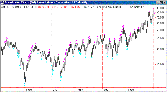
Also
note the accuracy of the JFC Reversal Indicator in picking accurate buy and sell
signals on this long term chart.
Before we are too quick to overlook some of the signals which don’t
seem to generate much movement on this chart, recall that each bar on this chart
represents one entire month of trading this stock issue.
With
this in mind, one realizes that even if the signal was good for only two bars it
was probably good for at least 40 trading days.
The
next chart is a one-minute chart of the S&P 500 Futures. It
illustrates the use of the JFC Reversal Indicator as a leading
indicator for the JFC Cluster Indicator. Note how the reversal plots appear
above or below the price bars well in advance of the JFC Cluster Indicator buy
or sell signals.
Frequently
the JFC Reversal Indicator will be the first of the group of four exhaustion
indicators which appear as these corrections within
the major market trend begin to exhibit signs
of an impending exhaustion.
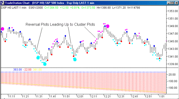
Also,
you will note, after observing the indicator combinations on a number of price
charts, that the JFC Cluster Indicator will frequently be the culmination of the
exhaustion phase.
Trend
reversals typically occur when the JFC Cluster Indicator appears a the end of a
market correction, allowing the trader to re-enter the market in the direction
of the dominant trend.
Using
the JFC Reversal Indicator as a “heads up” indicator as it leads up to the
plot of the JFC Cluster Indicator can
give the trader additional time during which to prepare for the upcoming trade
and possibly consider other factors which make up the traders individual trading
strategy.
The
final chart below is the March 2000 Soybeans Futures Contract, it also
illustrates the versatility of this trading tool.
Note
the buy and sell signals on this daily soybean chart.
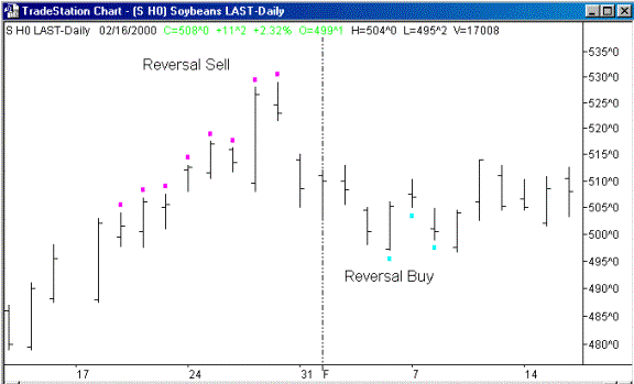
This
is the same indicator using the same settings which are used to generate signals
on a one-minute chart of Ebay as well as a monthly chart of General Motors.
This
chapter illustrates the application and interpretation of the JFC Reversal
Indicator, which is the first of our group of four exhaustion phase indicators.
Now let’s focus our attention on the next of the group, the JFC Exhaustion and
JFC Exhaustion 2 Indicators.
