|
|
|
|
|
|
|
|
JFC Entry Point Indicator Manual
The JFC Entry Point Indicator is used to select a specific price at which we will enter the market following confirmation of exhaustion.
This could possibly be the most important concept in the discussion of indicator based day trading.
This indicator is universal in nature and can be used on any market, any time frame.
Inputs
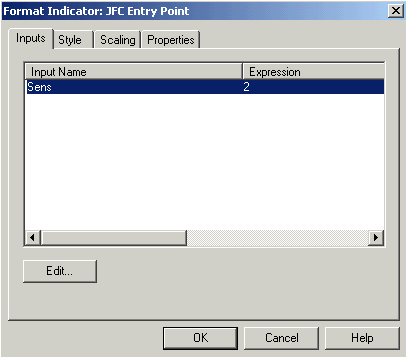
The SENS input is the only input active for the JFC Entry Point Indicator.
The setting on this input will set the number of bars prior to and following the indicator bar which are necessary for the program to calculate short term support and resistance. Therefore, the higher the value entered here, the lower the sensitivity. Lower numbers will increase the sensitivity of this tool.
Style
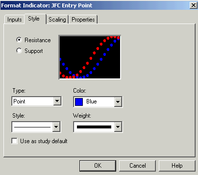
The style tabs for the JFC Entry Point Indicator are shown above. Defaults are blue for resistance and red for support. The weight is defaulted to the medium setting.
You will be using the exact value for the plots from this indicator to give
you an exact price at which to enter your position. For your convenience these
exact numbers are published in the data window.
They are listed as Support (red number) and Resistance(blue number). Reall our
coloring convention which has all colors of blue associated with a buying
situation ( you will buy the market when resistance is broken), and associates
shades of red with the sell side ( you will sell when support is broken).
Scaling
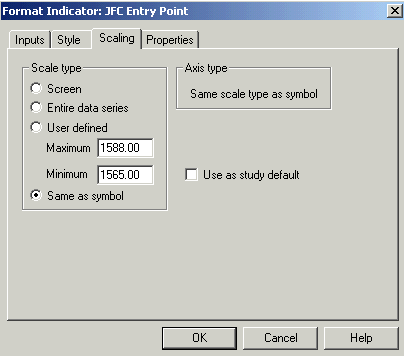
It is vital to the proper performance of this support and resistance generating indicator that the scaling always be set to Same as price data. Improper interpretation will occur with other settings.
Properties
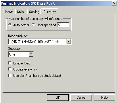
Equally important to the accurate interpretation of this tool is the requirement that the plots be directed into Subgraph 1.
Support and Resistance
The basis for the operation of the JFC Entry Point Indicator is the definition of short term support and resistance. Let's preface our remarks concerning the indicator with a general discussion of the dynamics of this pivotal concept.
Visualize for a moment that market prices and charting are nothing more than the graphic representation of human activity in the market place. Markets move higher when there are more buyers than sellers. Markets move lower when there are more sellers than buyers.
Let's assume for the purposes of illustration that there is one large trader or a group of traders who for whatever reason wish to purchase as many Dow Jones Futures Contracts as possible at a given price. They patiently bide their time until the market drops to their desired level and begin their buying activity. This buying activity drives the market a bit higher for a while, driving the price to a higher level than our traders are willing to pay. A bit of selling surfaces as our guys lie low for a while and the market drifts lower, back into our group's buying zone. They once again buy the contract until it rises out of their range. This can happen multiple times. Eventually, the market realizes there is significant buying activity in the market at a certain level. Other players come aboard, fueling the rally.
The level at which all the buying in the above example occurred is referred to as support. This is a price at which our group of traders decided to buy, or support the market.
The exact opposite can occur when our group of hypothetical traders decide to sell the market at a certain level, selling in volume each time the market rises to a given level. In this case we refer to this point as resistance, a point at which the forces of the market, in this case our group of traders, force the market lower.
The market is quick to identify these points as the activity around these points can be very useful in predicting near term market movement.
When the market breaks through one of our defined support or resistance points price movement can be significantly accelerated in the direction of the breakout. Think about this phenomenon again as a function of human behavior.
Back to our little group of traders. They are buying at a given level, and
the price continues to return back down to their level. Everything has a limit,
including these guy's trading accounts, so they must discontinue purchasing and
wait for the expected rise in price. However, a larger group of traders has
noticed a large accumulation of contracts at a given price and knows that there
will be substantial
selling if they can force the market down through this price level and spook our
first bunch into throwing in the towel.
Sure enough, the selling pressure from the second group, along with the market in general, forces the market through the previous support level. As the market continues to drift lower, our first group is nervously watching their equity slip away. Soon they are forced, either by fear or margin concerns, to liquidate their substantial holdings to stem further losses. This rapid liquidation of a large number of contracts which were accumulated over a much longer time frame results in panic selling by others holding long positions and new sellers getting on board the new downtrend, and the market continues to work lower.
This make believe scenario demonstrates the importance of support resistance in the real world markets.
The identification of these points on a chart can be vital to the success of a trader.
This is what the entry point indicator is designed to accomplish.
Before we expand our discussion of this simple but important tool, an important point needs to be made.
This indicator requires significantly more data input to perform its calculations than do any of the other tools in this group. It requires data not only from the bar on which the indicator appears, it must also work from data from the two bars previous to the marked bar but also from the two bars which appear after the marked bar. Essentially there must be five data bars involved to create this signal - the bar on which the dot appears as well as the two preceding and the two trailing bars.
For this reason, this indicator can appear to be an excellent timing tool when viewed on historical charts, as the dots frequently appear on significant turning points on the chart. However, we must always remember that when viewing this tool on real time charts that the dot will not appear until the two bars appearing AFTER the marked bar have been formed.
The question now arises, since this tool appears two bars behind the current market, how can it be used as an entry tool?
Recall our previous discussion concerning support and resistance. This indicator is designed to identify points at which activity was of sufficient strength to form intermediate support or resistance on the chart over a 5 bar period. Recall how important the identification of these points was in our hypothetical scenario above. In this instance, it was important to our second group of traders to note the position of buying significant enough to cause a temporary low in the market. You'll also remember that this realization came some time after the actual buying took place, as it actually happened over several minutes in the market. The point is that this realization was more important to note after a bit of time had passed.
We can use this intermediate support and resistance identification tool in our own short term trading. With this tool we are able to identify points at which significant market activity is likely to occur should the market be successful in breaking through this particular area.
When a buying zone, for instance, is identified by our group of short term indicators, we are then looking for a point to enter the market on the long side.
We will now use the JFC Entry Point Indicator to define overhead resistance
and then allow the market to confirm its new direction by breaking through this
overhead resistance.
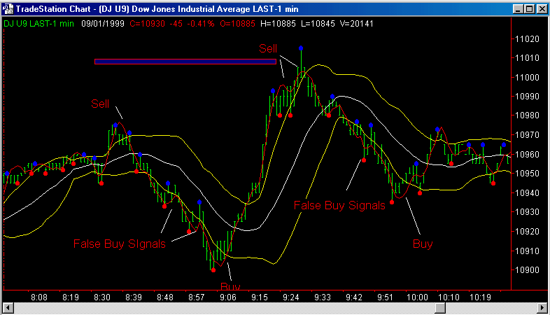
Recall from our discussion in the section regarding the JFC Exhaustion Indicator that at the time we identified several signals identified by this indicator which would not have produced profitable results. This chart is a reproduction of this same day with the false buy signals clearly labeled.
In this image we have removed the lines from the JFC Exhaustion Indicator and
added short horizontal blue lines to the right of each entry point indicator for
clarity.
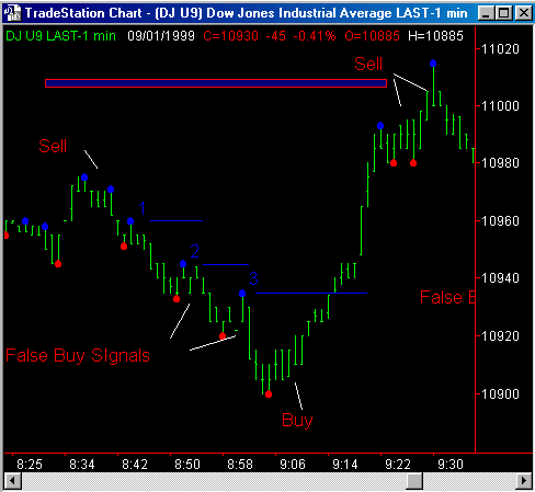
Note that at the appearance of the first false buy signal, the buy stop would have been placed at point #1, the level of the most recent entry point plot. Recalling that we must have at least two bars of data present to the right of the marked bar , the #2 point would not be useable here as the program would not have sufficient data at this point to place the blue dot in real time charting.
Likewise, at the appearance of the 2nd false buy signal, the trader would place the buy stop for entry into a long position at the point marked by blue dot #2.
In both instances above, entry would have never been made since the subsequent price activity dropped steadily away from our buy point. Note that this method of entry has now avoided two losing entries in this example.
Now, moving to the next buy point, note that after the next buy signal the
buy stop would placed at blue dot #3 which is now available for use. Our
position is filled as the market moves through our buy stop level. It is evident
that considerable buying was uncovered as the market worked its way through the
resistance as defined by the
entry point indicator as the market moved up sharply once this resistance was
broken.
Recapping, note how the entry point indicator was able to delay our entry until we were able to take advantage of the best buy signal of the three that were generated as the market fell lower and lower. Remember, knowing when NOT to trade can be as important or sometimes more important than knowing WHEN to trade.
Also, keep in mind that this entry point indicator will function with any of
the trend definition indicators in this package. Although the exhaustion
indicator was used for short term trend definition, the same strategy will apply
when using the entry point indicator with the reversal, real time pivot or
cluster indicators, or any combination of
the 4 tools we use for trend definition.
We are frequently asked, when discussing the use of this indicator, why we wait for the market to go up before we buy it. Why not buy it lower, at the buy point, rather than give up the distance between the actual buy signal and the resistance level defined by the JFC Entry Point Indicator?
Clearly, it is one thing to define the long term and short term trends as we have done so far in the manual. While these determinations are very important to the trading equation, they are by no means the total answer.
The final piece of the puzzle is complete when we force the market to break former resistance and confirm by its own activity that the trend has indeed changed. Then and only then should we feel confident in taking a position in the market.
Look back again at the last chart. If we had taken long positions each time the buy signal was given by the JFC Exhaustion Indicator we would have either suffered some losing trades or at the best had to suffer through a substantial drawdown waiting for our trade to turn into a profit.
On the other hand, waiting for the market to confirm the trend change by
breaking overhead resistance as defined by the JFC Entry Point Indicator we were
able to immediately see our trade work for us and eventually result in a
profitable trade.
