|
|
|
|

Support Resource Center
Chart 2
JFC Market Direction Indicator
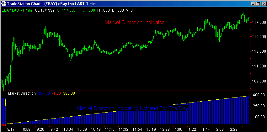
Chart #2
The JFC Market Direction Indicator is signaling an uptrend for the
entire trading day.
|
|
|
|
Support Resource Center
Chart 2
JFC Market Direction Indicator
Chart #2
The JFC Market Direction Indicator is signaling an uptrend for the
entire trading day.
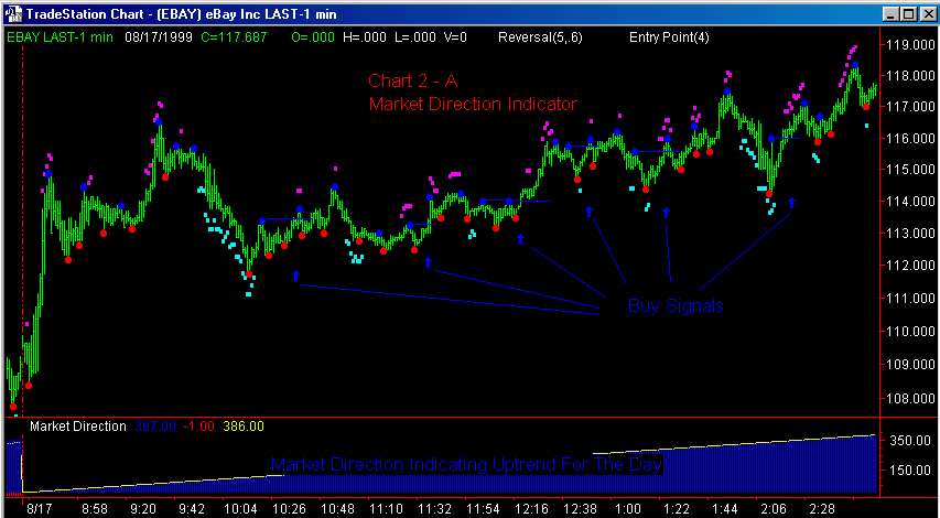
During the initial portion of the video presentation which covers the theory and application of the JFC Market Direction Indicator I briefly mention where multiple buy indications would be detailed by several of the other indicators in your trading package.
Recal that, with the Market Direction Indicator calling for an uptrend for the remainder of the session, we will only be considering the buy side of this market on this particular day.
On Chart 2 - A above I have reproduced the same chart used in the video and added two of our indicators which can be used in this case to first, open a buying window, and second, to define an actual entry point for our trade.
I have used the JFC Reversal Indicator to identify the buying windows on the chart. Briefly, the JFC Reversal Indicator plots small cyan squares below the price bars in response to a downtrend which is exhibiting signs of exhaustion. The downside exhaustion is complete when the cyan squares STOP forming, at which time a new uptrend is expected to begin forming. The same indicator is responsible for the small magenta squares you can observe above the price bars. These begin to form when a current uptrend is exhibiting signs of exhaustion and stop forming when the rally has completed the exhaustion phase. A new downtrend will then begin. Considerably more detail on the application and interpretation of this program can be found in the JFC Reversal Section of the Support Center.
The small red dots below the bars and the small blue dots above the bars are placed by the JFC Entry Point Indicator. The red dots give exact entry points for short trades by defining short term support in the market. Sell stops are placed at this level. The small blue dots above the bars are used to place buy stops at calculated short term resistance. In the case of this price chart, I have placed short blue lines to the right of the long entry points to demonstrate their location and signify a new long position when the market trades through the buy stop placed at the level of the blue line. I have also placed small blue arrows at the time on the chart when the actual long position was taken.
Again, considerably more information is available on the JFC Entry Point Indicator on Charts 37 through 39 EPT. You will find a complete discussion here detailing the theory, application and interpretation of this trading tool.
Please be aware that these short blue lines and small blue arrows are not a part of any indicator program plotted on the screen. They have been added manually to the chart strictly to enhance the explanation of the structure and use of these indicators.
In each buying instance above, a buy window was first identified by the JFC Reversal Indicator. Subsequently, a specific level at which a buy stop will be placed is determined by the JFC Entry Point Indicator's nearest, logical resistance level. The end result is a new long position when the market confirms the trend change by trading through overhead resistance.
Each of the buying
situations identified on the chart above was good for a profit
of at least $1.00 per share
on E Bay. Stock market day traders, many of whom will trade for a $.50
per share move or less in this market, would find this technique very useful
during their trading day. Since this indicator package is designed with
multiple user defined inputs which can be used to adjust the sensitivity
of all the tools in the box, traders will find it easy to adjust the use
of these programs to fit what ever trading style, objectives, trading frequency,
etc. which will fit their individual trading style. For instance, the sensitivities
of these indicators could be increased to the point that several more buying
situations, although with a smaller potential, could have been ientified.